Anthony’s Pizzeria
Branding
Logo and brand created for a pizzeria and deli. The theme was Italian, New York, and friendly. The twin towers were created using an Italian flag turned on it’s side, the stature of liberty was created using negative space, this really brings in the New York theme. Red and green were used because they are the colors used in the Italian flag. A script font was used for Anthony’s name to give the logo a friendly feel.
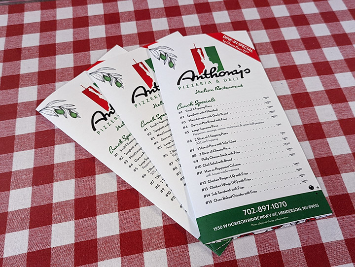
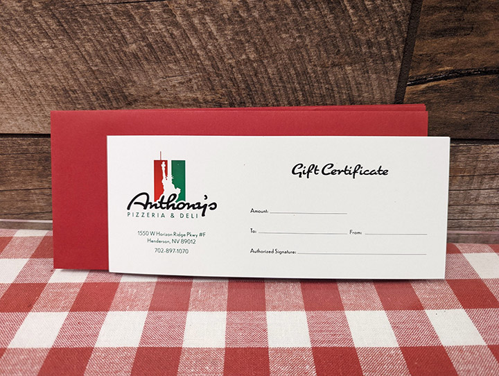
All brand materials are done in red and green. The menus use hand drawn Italian food elements to save space and add interest to break up the text.
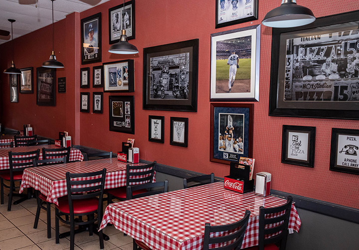
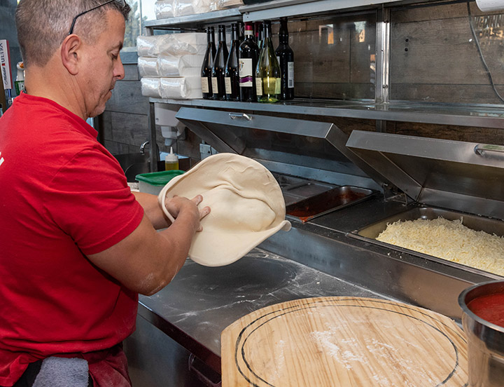
Photography was created to highlight the friendly family atmosphere and used on the website. Which was created using the brand guidelines for consistency.
What We Did
- Logo
- Colors
- Fonts
- Menu
- Gift Certificate
- Photography
- Website Consulting

