Hard Hits
Branding
Logo and brand created for Heather Hernandez, a female boxing coach. She offers in-person training, and is looking to expand into video tutorials, work out programs, clothing, and nutrition programs.
The majority of her clients are 20-30 year olds and she attracts seniors 60+. Heather’s clients refer to her as badass, no BS, cares about her clients, not intimidating, genuine, and funny.
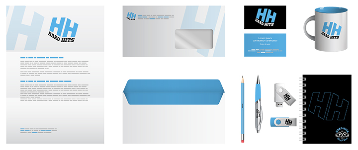
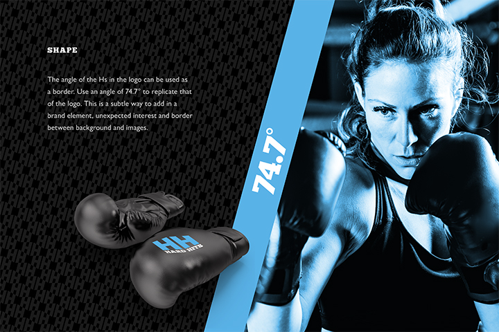
Heather’s logo and brand needed to be hard, but not intimidating. This was achieved by using thick bold letters with sharp corners and bringing in a lighter blue color to soften the feel. Heather did not want to use her name in order to grow the brand to be bigger than herself. So we took part of her tag line “Hard hits, don’t quit” Which also happens to have double H’s just like her name. The double H’s also look like dumb bells which ties into the fitness aspect of her brand.
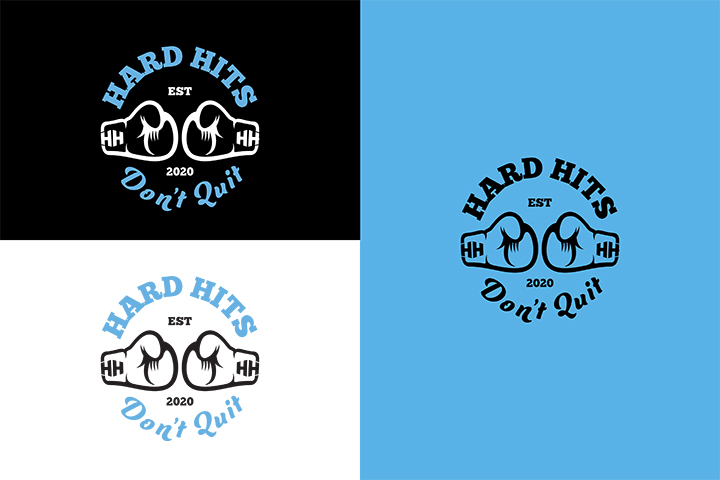
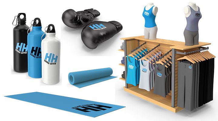
A secondary logo was created for Heather that focuses on her tag line. The double H’s are used in the laces of the gloves to tie the two together in a subtle way. This logo will serve as a great option to use on clothing and swag. It gives the brand some versatility.
What we did
- Concept
- Logo
- Secondary Logo
- Branding
- Pattern

