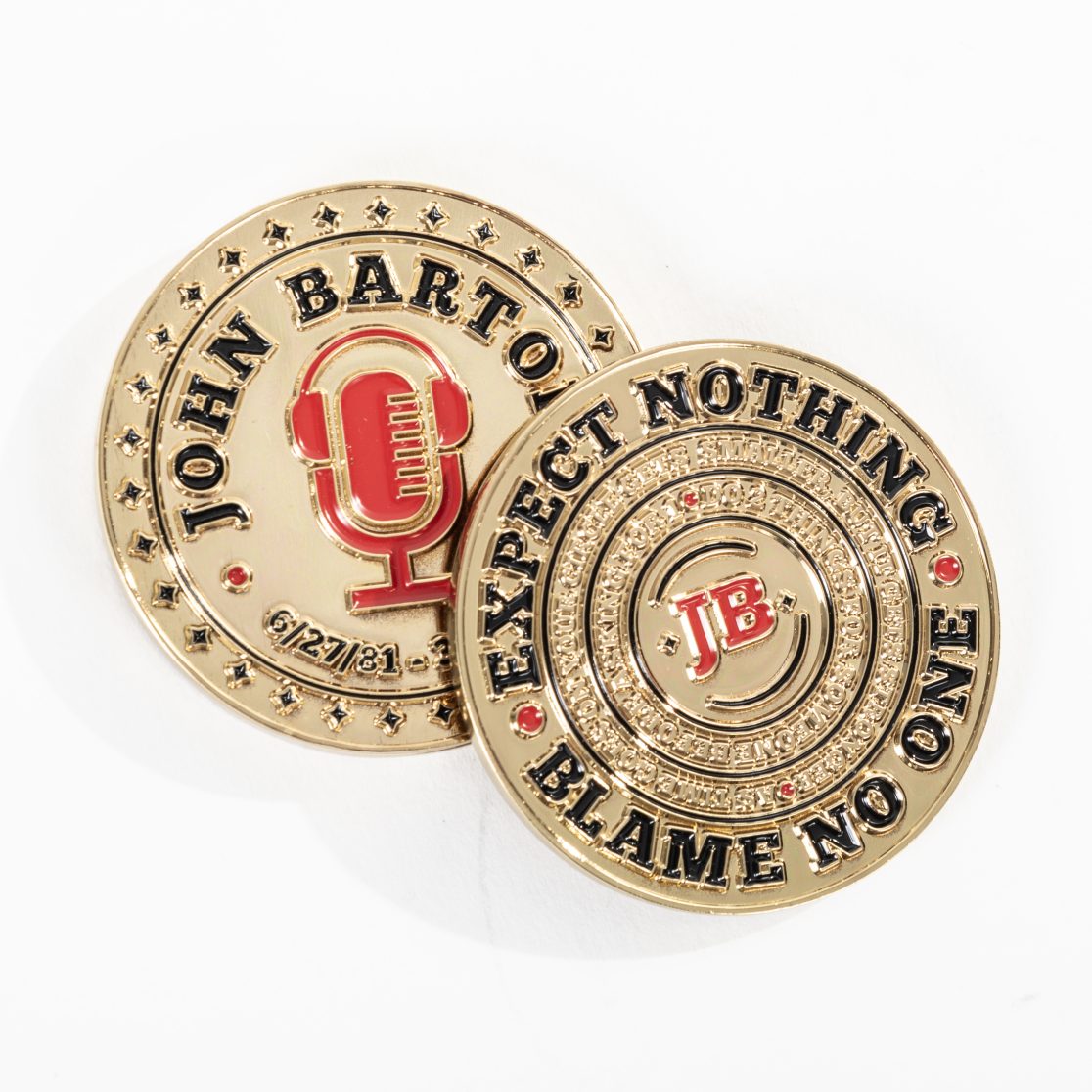
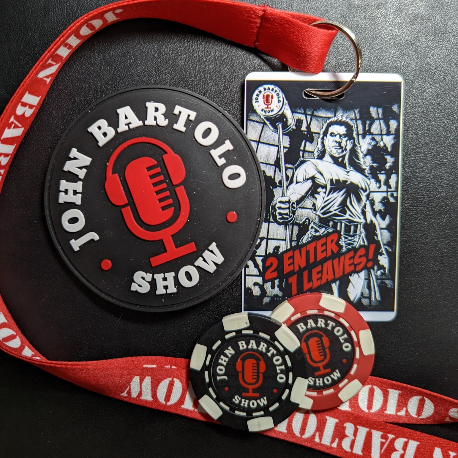
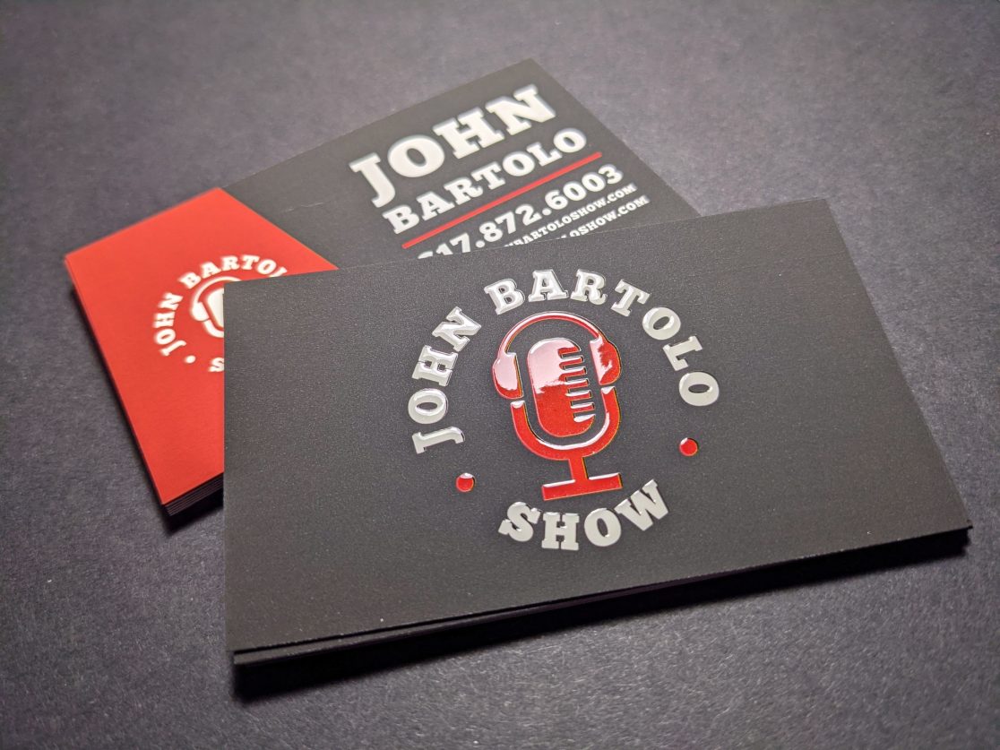
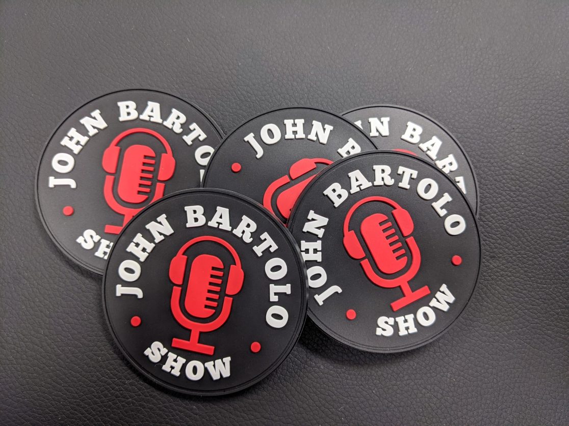
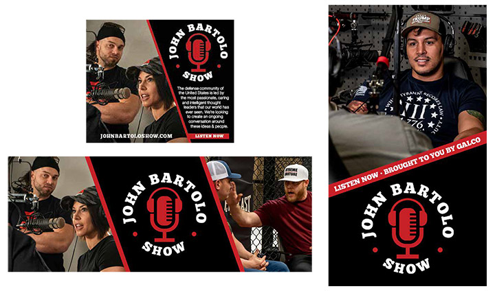
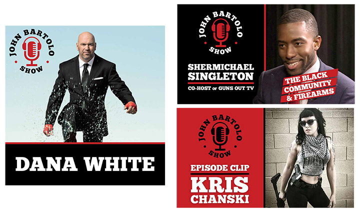
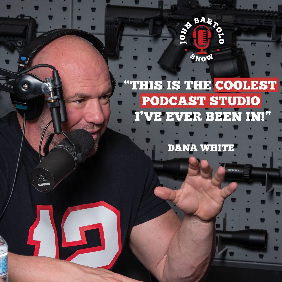
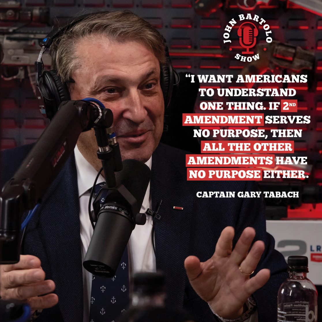
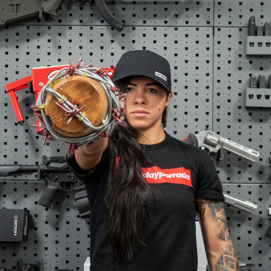
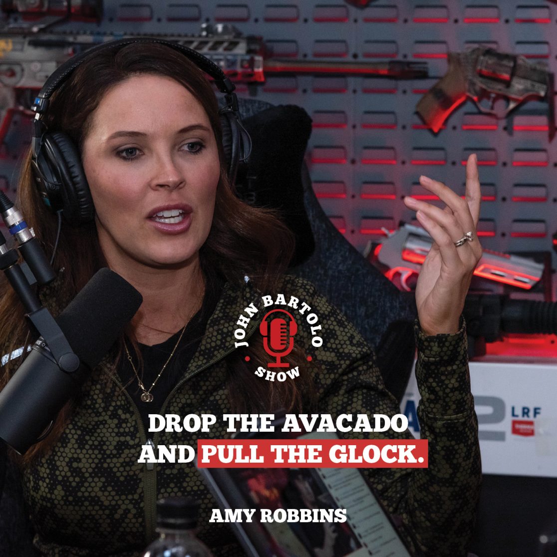
Rebrand project for the John Bartolo Show, a podcast about business, politics, fitness, and personal development. The logo needed to be strong and updated and a brand built out for marketing materials.
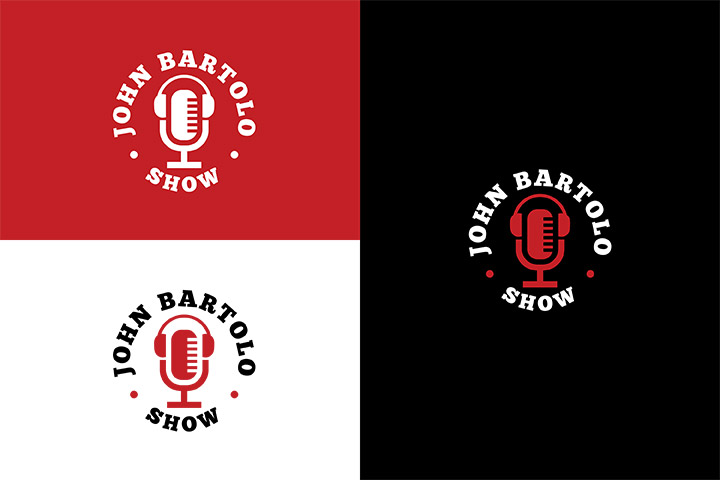
A thick, chunky font was used to convey John Bartolo’s strong voice and character. Red, black and white were used for brand colors to keep the palette simple. Black is a strong, authoritative color with a little rebellion mixed in to balance the red. Red represents strength and courage. These colors together reflect John’s personality and how he approaches topics and shakes up the 2A industry.
A slanted red line was used to shake up the typical design and draw attention to the branding materials. John loved to shake industries up and his marketing materials should represent that.

